
Modica Group - Inbox Redesign - Case Study
Modica Group is a global messaging enterprise company based in New Zealand.
First, learn more about the foundational research study to understand the context.
Role in project: UX Designer
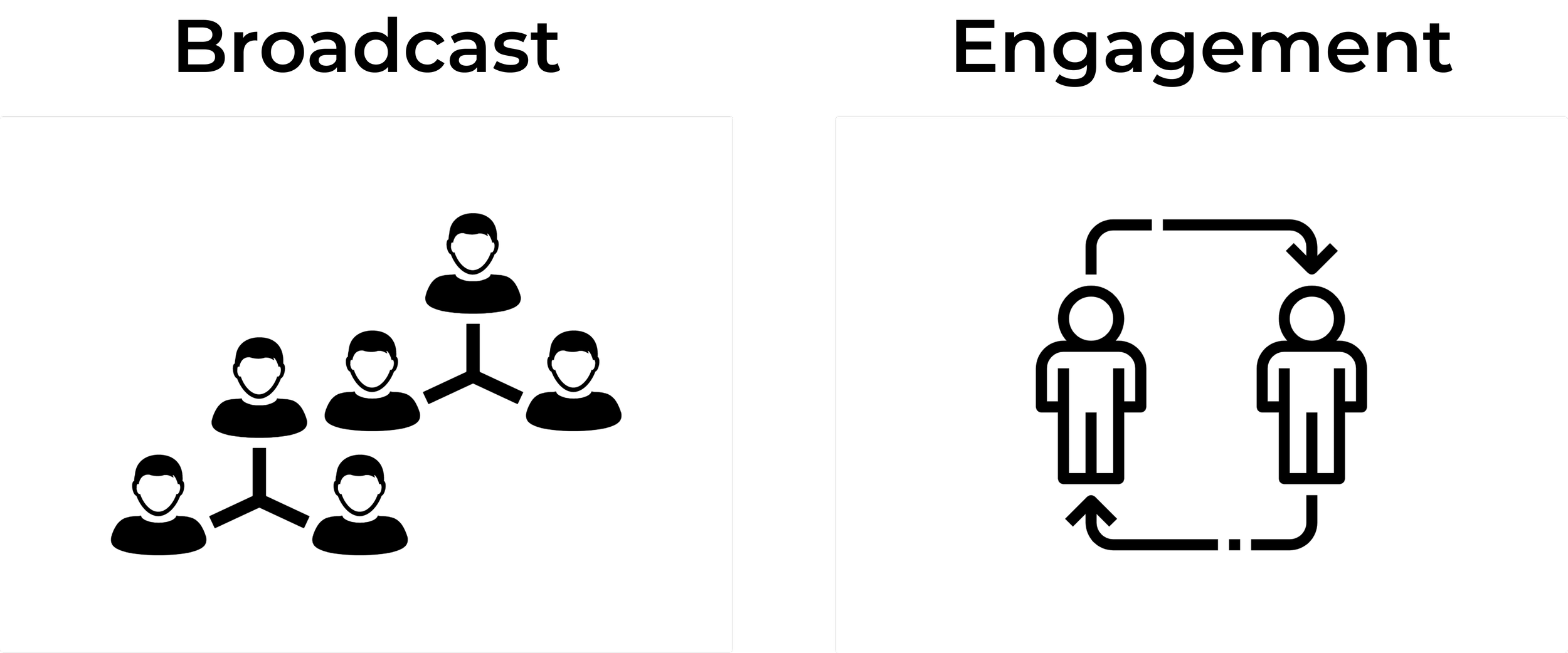
After analysing the results from our foundational research, we were able to identify a theme of pain points from our users. Our research formed 2 product categories, "broadcast" and "engagement". Broadcast products offer the ability to send bulk SMS messages to large audience sizes (A list of 300,000 subscribers). Meanwhile, the engagement category is primarily for one-to-one SMS conversations (A recruiter filling a security shift).

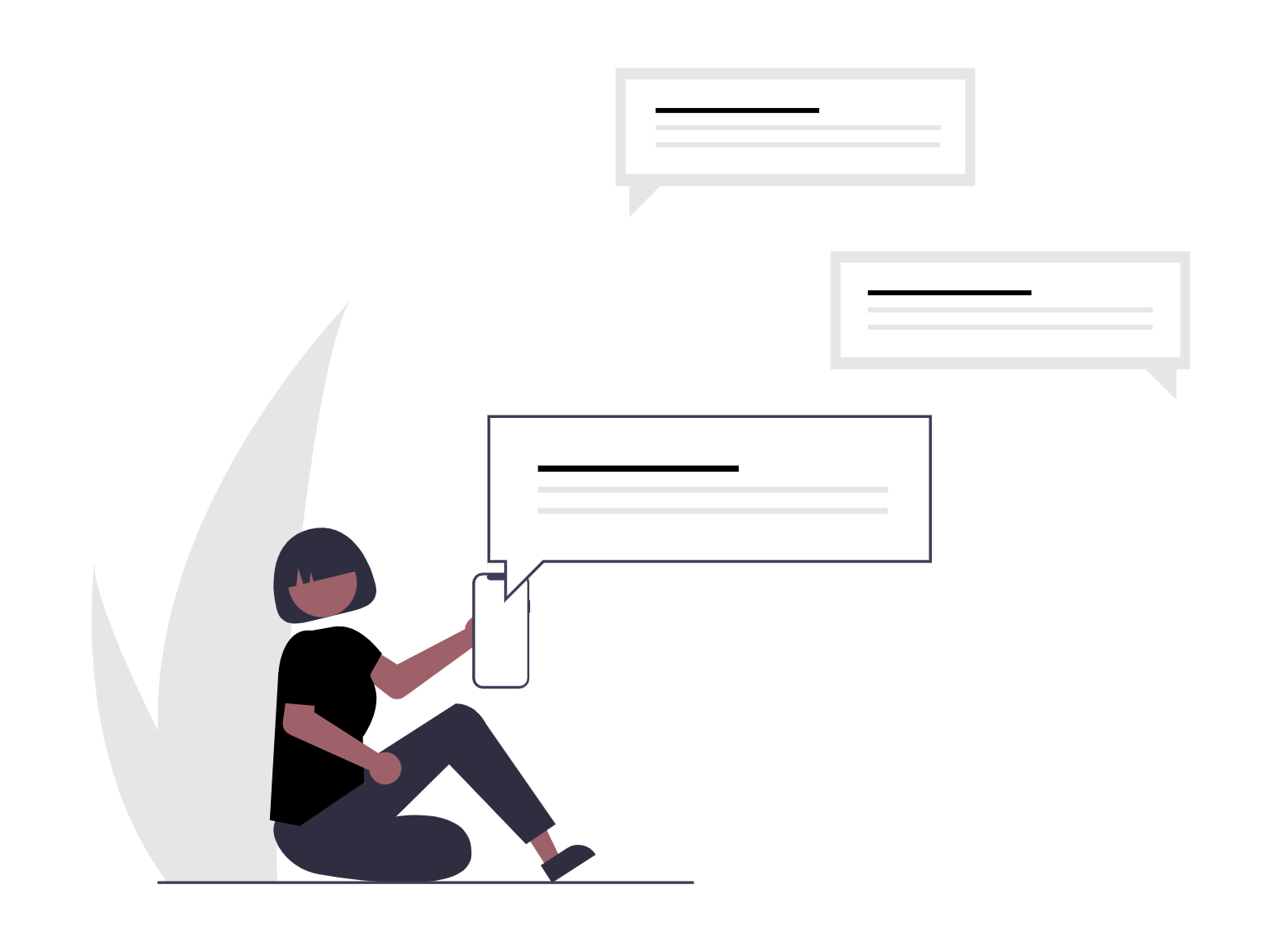
A common pain point identified throughout the foundational research analysis was the difficulty to view and track one-to-one conversations with an SMS recipient. We discovered that users regularly needed to switch between the "Inbox" and "Message History"(shows messages you have sent) tabs to follow their conversations.
This was a tedious process, regularly slowing down the users work flow. As a design team we set a unified goal to build a new engagement inbox that would unite message threads and tie all the loose ends. (No more switching between tabs!)
Let’s take a look at the original inbox design
The example only shows two messages, but you can imagine with 300 other replies - you start to lose hierarchy and clarity.
The redesign
Introducing the new conversation view. We have taken the previous inbox table-style design and transformed it into the ultimate messaging hub for our users.
The discovery phase
Before jumping into Figma with our bold new ideas, we examined the existing inbox design. We reviewed the current features and selected elements for the redesign. As a team, we decided all features were essential. We were then able to understand the existing user-journey and define our next steps for the redesign.
We then developed a range of questions to ask internal stakeholders, referring to technical limitations and potential redesign obstacles.
Throughout the discovery stage we researched other inbox designs from competitors and other companies, learning how they approached similar problems.
Next step was the ideation workshops (the workshop included internal staff from different departments of Modica), we organised a total of 4.
Workshop 1. Inital conversation workshop
An opportunity to introduce the workhops, share lightning demos and collaborate on an empathy map.
Workshop 2. An engagement user having a back-and-forth conversation with their customer.
How might we make talking with your customer feel as natural and stress-free as texting your friend about your weekend plans?
Workshop 3. An engagement user viewing all of their recent conversations.
How might we help our customers feel satisfied that they have everything under control and know just what to do next?
Workshop 4. An engagement user looking for a conversation they've had with a customer in the past.
How might we make it easy to find that interaction you had with your (irate) customer last week while you simultaneously placate that same customer over the phone and look up the invoice she's complaining about?
We determined our hypothesis for the inbox redesign project:
"We believe that by improving the user experience for holding a conversation in our engagement software, we will increase the number of replies sent per active user."
The workhops
The workshops were an important stage in our project, we included internal stakeholders from differents parts of the business. It was a great opportunity to share knowledge and combine ideas.
Each workshop addressed a seperate problem, this required some out the box thinking. To assist with getting into the conversation mindset, every workshop included brain warm-up exercises and lightning demos.
The kick-off workshop included an empathy mapping activity, it was an excellent exercise to unite the groups thinking and put ourselves in the shoes of our end users.
Each workshop concluded with idea sketching and critique. This was an opportunity for each participant to design basic conversation wireframes and critique them as a group. The wireframes provided inspiration for our first iteration of the new inbox.
The design
With the inspiration and support of workshop wireframes and other inbox designs, we were able to create our first concept. We agreed on a new split view for the inbox page, the conversation list on the left and the message thread on the right. Progressing more and more with the design, we soon realised our scope of work was expanding with each new feature we added. Realising this, we turned our focus to only include current functionality (MVP) and moved our big picture ideas to "Post MVP".
User acceptance testing
Will users know how to navigate this new inbox design? With the page changing drastically from the original, it was important to test our assumptions with familiar and unfamiliar users.
We tested various components of the new design, including:
Can users find the relevant conversation and select it.
Can users identify that they have new messages, and how do they know what messages in the list are new.
Can users reply to a message in the thread.
Will users understand how the read and unread functionality works.
We set up numerous user testing sessions with familiar and unfamiliar engagement product users. Our nominated facilitator would run through the process with two observers, analysing how the user behaved and reacted to the new design. Each test included 2 scenarios with different actions for the user to simulate on the prototype.
Results from the testing influenced our following iterations, we were able to make simple changes that enhanced the overall user experience of the inbox. We introduced new states to guide the user with steps they could take on the inbox page.
The release process & A/B testing
With the MVP design developed and tested, we were able to release the new inbox page to our users. As it was such a drastic change, we decided to utilise the feature flagging tool LaunchDarkly. We were in full control of our deployment, with the ability to release to specific user segments and environments. The tool allowed us to measure our performance, we tracked custom KPI's to evaluate how well the new design was doing against the old.
We noticed an overall improvement with messaging in the new inbox page. We have received positive user feedback since the roll-out.
UX Design is iterative, the MVP release is just the beginning. The project is still ongoing, continuously being evaluated for improvements to enhance the overall user experience.